APPLICATION OF STATISTICS
Concept of Statistics
Statistics
Explain the concept of statistics
Statistics is the study of collection, analysis, interpretation, presentation, and organization of data. Data refers to crude or uninterrupted information.
In applying statistics to, for example, a scientific, industrial, or societal problem, it is necessary to begin with a population or process to be studied. Populations can be diverse topics such as "all persons living in a country" or "every household in a village". It deals with all aspects of data including the planning of data collection in terms of the design of surveys and experiments.
Types of statistics
Two main statistical methodologies are used in data analysis, namely, descriptive statistics and inferential statistics.
- Descriptive statistics summarizes data from a large sample using indexes such as the mean or standard deviation. Descriptive statistics are distinguished from inferential statistics (or inductive statistics), in that descriptive statistics aim to summarize a sample, rather than use the data to learn about the population that the sample of data is thought to represent.
- Inferential statistics draws conclusions from data that are subject to random variation (e.g., observational errors, sampling variation). Descriptive statistics are most often concerned with two sets of properties of a distribution (sample or population): (i) Central tendency (or location) – this seeks to characterize the distribution's central or typical value. (ii) Dispersion (or variability) – this characterizes the extent to which members of the distribution depart from its centre and each other.
Types of Statistical Data
Differentiate types of statistical data
When working with statistics, it’s important to recognize the different types of data. Data are the actual pieces of information that you collect through your study. For example, if you ask five of your friends how many pets they own, they might give you the following data: 0, 2, 1, 4, 18. (The fifth friend might count each of her aquarium fish as a separate pet). Not all data are numbers; let’s say you also record the gender of each of your friends, getting the following data: male, male, female, male, female.
Most data fall into one of two groups: numerical or categorical.
- Numerical data. These data have meaning as a measurement, such as a person’s height, weight, IQ, or blood pressure; or they’re a count, such as the number of stock shares a person owns, how many teeth a dog has, or how many pages you can read of your favourite book before you fall asleep. Statisticians also call numerical data quantitative data. Numerical data can be further broken into two types: discrete and continuous. Discrete data represent items that can be counted; they take on possible values that can be listed out. The list of possible values may be fixed (also called finite); or it may go from 0, 1, 2, on to infinity (making it countably infinite). Continuous data represent measurements; their possible values cannot be counted and can only be described using intervals on the real number line. For example, the exact amount of gas purchased at the filling station for cars with 20-gallon tanks would be continuous data from 0 gallons to 20 gallons, represented by the interval [0, 20], inclusive. You might pump 8.40 gallons, or 8.41, or 8.414863 gallons, or any possible number from 0 to 20. In this way, continuous data can be thought of as being uncountably infinite. For ease of recordkeeping, statisticians usually pick some point in the number to round off.
- Categorical data: Categorical data represent characteristics such as a person’s gender, marital status, hometown, or the types of movies they like. Categorical data can take on numerical values (such as “1” indicating male and “2” indicating female), but those numbers don’t have mathematical meaning and you couldn’t add them together. Other names for categorical data are qualitative data, or Yes/No data.
- Ordinal data: These data mixes numerical and categorical data. The data fall into categories, but the numbers placed on the categories have meaning. For example, rating a restaurant on a scale from 0 (lowest) to 4 (highest) stars gives ordinal data. Ordinal data are often treated as categorical, where the groups are ordered when graphs and charts are made. However, unlike categorical data, the numbers do have mathematical meaning. For example, if you survey 100 people and ask them to rate a restaurant on a scale from 0 to 4, taking the average of the 100 responses will have meaning. This would not be the case with categorical data.
Statistical data can be expressed in different levels or scales of measurement. These are:
- Nominal scale: This type of scale has qualitative property such that one my decide to express the data as ‘excellent’, ‘good’, ‘fair’ or ‘poor’ and maybe use grades, e.g. A, B, C, D and so on. Nominal scale may also include numerical values. For example one may decide to let 1, 2, 3 and 4 stand for ‘excellent’, ‘good’, ‘fair’ or ‘poor’ or vice versa.
- Ordinal scale: This scale involves ranking, so it is also qualitative in nature. The data involves rank orders or positions among events or objects. These statistics attempt to provide quality or position. For example, if Chacha scored 5% in Geography Test while Tibaijuka scored 95%, then we can say that the former ranked number 19 while the latter ranked number 1 out of 20 students. Sometimes, values such as ½ of the class scored below 50% in Geography may be included in the ranking.
- Interval scale: This type of scale employs truly quantitative values and allows the use of mathematical operations such as adding, subtracting, multiplying and dividing. At no time is zero present in this scale. For example, the range of temperature in which rice grows well is 25°C and 45°C; most livestock keepers get between 10 and 15 litres of milk per cow per day.
- Ratio scale: This is a type of scale that is used to make comparisons between values or quantities. For example, Ms Iku harvested 50 sacks of maize which is twice Mr Aritamba obtained from the same acreage because the former applied fertilizer and good farming practices while the latter did not.
| Scale | Properties | Examples |
| Nominal | Indicates a difference, without any implied ordering | Religion: 1=catholic; 2=protestant; 3=Jewish; 4=Muslim; 5=other |
| Ordinal | Indicates a difference, and the direction of the difference(e.g., more or less than) | Attitude on a subject:1=strongly disagree, 2=disagree; 3=don't care / don't know; 4=agree; 5=strongly agree |
| Interval | Indicates a difference, with directionality and amount of difference in equal intervals | Temperature in CelsiusOccupational Prestige (12-96) |
| Ratio | Indicates a difference, the direction of the difference, the amount of the difference in equal intervals, an absolute zero | Temperature in KelvinIncomeYears of schooling |
Variables
A variable is anything or characteristic that data may have, or an attribute which changes in value under given conditions. Variables include population size, age, sex, altitude, temperature and time.
There two broad types of variables, namely, independent and dependent variables.
- An independent variable is a variable factor which influences the changes of other variables or outcomes. The independent variable is also known as manipulated variable. This is the factor manipulated (controlled) by the researcher, and it produces one or more results known as dependent variables. There may be more than several dependent variables, because manipulating the independent variables can influence many different things. For example, an experiment to test the effects of a certain fertilizer, upon plant growth, could measure height, number of fruits, and the average weight of the fruits produced. All these are varied analyzed factors, arising from the manipulation of one independent variable, the amount of fertilizer.
- A dependent variable is an outcome or result that has been influenced by other variables. A dependent variable does not influence or change other variables. The dependent variable responds to independent variable. It is called dependent because it “depends” on the independent variable. In any research, you cannot have a dependent variable without an independent variable. Any alteration in the independent variable will change the dependent variable.For example, you might be interested to carry out an experiment to determine the influence of the concentration of phosphorus fertilizer on maize growth. To conduct this experiment, you grow maize in similar conditions of soil and atmospheric environment but vary the quantity of fertilizer in each test (independent variable). Then you measure the height of maize plants (dependent valuable) after a certain interval of time to find out the influence of the fertilizer on maize growth. The value of the height you will obtain will obviously depend on the amount (concentration) of the fertilizer applied. And, in this case, you will obviously get different heights depending on the quantity of fertilizer applied.
Graphical Data
Present data graphically
After data have been collected, the next step is to present the data in different ways and forms. Some of the forms in which the data may be presented include charts, graphs, lists, diagrams, tables, essays, graphs, histograms, and even sketches.
Line (linear) graphs
Line graphs have unique properties that distinguish them from other graphs. The properties of line graphs are as follows:
- The graphs are drawn by plotting a dependent variable against an independent variable and points are joined by a line.
- The values on the y-axis start at point zero.
General procedure for drawing line graphs
- Get the required data for plotting the graph.
- Identify the independent and dependent variable. Statistically, the independent variables are placed on the x-axis while the dependent variables are placed on the y-axis.
- Decide on the vertical scale depending on the graph space and values of the independent variable available.
- Decide on the horizontal spacing of the graph according to graph space available.
- Draw and divide the vertical and horizontal axes depending on the respective scales.
- Plot and join the points to get the graph.
- Write the title of the graph you have drawn.
- Indicate the scale of the graph.
- Show the key for the graph if need be.
Line graphs can be sub-divided into:
- Simple line graphs
- Group (comparatives) line graphs
- Compound line graphs
- Divergent line graphs
Simple line graph
Presenting the statistical data by a simple line graph is the most common and popular method. The simple line graphs are easy to construct and interpret. They have many uses which include showing temperature, farm outputs, population, and mineral production, among others.
Construction procedure:
The graph can be drawn after getting the required data. Consider the following table which shows the average monthly temperature recorded in a certain weather station:
Average monthly temperature for station X
| Month | Jan | Feb | Mar | Apr | May | Jun | Jul | Aug | Sept | Oct | Nov | Dec |
| Temp (°C) | 23 | 24 | 26 | 28 | 29 | 28 | 26 | 26 | 26 | 27 | 26 | 25 |
The following procedures may be used:
- Identify the variables. The dependent variable is temperature and the independent variable is months.
- Determine a vertical scale. Assume that the graph space available is 6 cm vertically. Vertical scale = maximum value of the divided by the graph space availablee.g. 30°C/6 cm = 5°C per centimetre. Therefore, in the vertical axis (x-axis), 1 cm will represent 5°C
- Determine the horizontal scale (y-axis) depending on the available space. Let, for instance, 1 cm represent one month.
- Draw both axes and label them: y-axis for temperature and x-axis for months.
- Plot the points and join them by a smooth line to make a curve.
- Insert the title and scale.
The following is a simple line graph showing monthly temperature for station X.
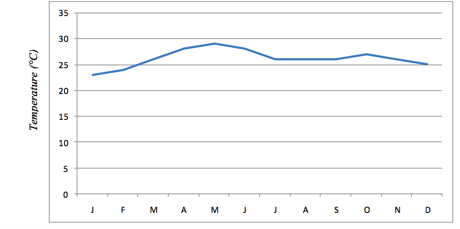
Average monthly temperature for Station X
Source: Hypothetical data
Scale
- Vertical – 1 cm:3°C
- Horizontal – 1 cm:1 month
Advantages of simple line graphs
- They are easy to draw, read and interpret.
- They show specific values of data, so if you are given one variable the other can easily be determined.
- They show patterns in data clearly, meaning that they visibly show how one variable is affected by the other as it increases of decreases.
- They enable the viewer to make predictions about the results of data. So they allow for determination of intermediate or continuing values.
- It is easy to read the exact values against plotted points on straight line graphs.
- A broken scale can be used when the value starts at a large number.
Disadvantages of simple line graphs
- They can only be used to show the data of one item over time.
- One can change the data of a line graph by not using consistent scales on the axis.
- They can give a wrong impression on the continuity of data even when there are periods when data is not available.
- They do not give a clear visual impression of the actual quantities.
Group (comparative) line graph
A group line graph is also known by the following terms:
- Comparative line graph
- Composite line graph
- Multiple line graph
- Polygraph
A group line graph involves drawing more than one line on the same statistical graph. It shows the relationship between sets of similar statistics for two or more items.
Usefulness of a group line graph
- Comparing different values or trends in two or more data variables.
- Examining the possibility of a relationship existing between the distributions of a number of variables over time.
- Comparing the distribution of the same variable at different places.
Construction:
The method of drawing a group line graph is the same as for a simple line graph. Therefore, to draw each single line in a group line graph, follow similar steps used for construction of the simple line graph.
The following things should be considered before drawing the graph:
- The lines drawn should not be uniform in colour, thickness, general appearance, etc (See the graph below in which each line has a different colour).
- The number of lines that a graph can accommodate should not exceed 5, meaning that not more than 5 items should be compared in a single graph.
The following table shows banana production (in tonnes) by three villages in Ingwe Division, Tarime district. These data have been used to plot the group (comparative) line graph as shown below:
Banana production by three villages
| Village/Year | Geisangora | Itiryo | Bungurere | Nyansincha |
| 2000 | 10 | 15 | 25 | 25 |
| 2001 | 20 | 10 | 15 | 20 |
| 2002 | 3 | 10 | 10 | 15 |
Source: Hypothetical data
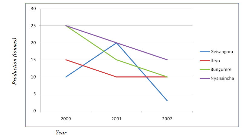
Maize production by three villages between 2000 and 2002
Advantages of group line graph
- The quantity of each component is shown clearly by different line shadings.
- Time and space are saved since all the line graphs are drawn at ago as a group.
Disadvantages of group line graph
- The lines can be overcrowded and hence become difficult to read and interpret if many data are involved.
- It does not give a clear visual impression of actual quantities.
Compound line graph
A compound line graph is used to analyse the total and the individual inputs of the specific commodities or economic sectors. The graph involves drawing two or more lines, each line corresponding to one item in a different year or region. The items are differentiated from each other or one another by shading differently.
Construction:
The table below is used for construction of the graph. The table contains hypothetical figures for mineral exports between 2010 and 2012.
| Year/Mineral | Diamond | Gold | Tanzanite |
| 2010 | 10,000 | 16,000 | 20,000 |
| 2011 | 20,000 | 25,000 | 32,000 |
| 2012 | 25,000 | 35,000 | 40,000 |
Procedure:
- Simplify the data to make the presentation work easy by dividing each value by 1000.
| Year /Mineral | Diamond | Gold | Tanzanite |
| 2010 | 10 | 16 | 20 |
| 2011 | 20 | 25 | 32 |
| 2012 | 25 | 35 | 40 |
- Add the values for each year to get the cumulative export: 2010 = 10+16+20 = 46; 2011 = 20+25+32 = 77; 20112 = 25+35+40 =100; These values will be used to determine the uppermost height of the graph. They will also help estimate the scale to be used. In case of the above data, the highest value is 100. So if we want to use the scale of 1 cm to 1 tonne (1000 tonnes in reality), the uppermost height of our graph will be 100 cm (see the graph drawn
- Plot the values for mineral exports against years on a graph. Usually the line graph for data with the highest values is drawn first. Thus, first draw the line graph for tanzanite since it has the highest values, followed by that of gold and finally diamond.
- Draw the second line graph above the first one to show the next component. To get the values for plotting the second line graph, add the values of the first item (in this case, tanzanite) to that of the second item (gold) for each year, thus: 2010 = 20+6 =36; 2011 = 32+25 =57; 2012 = 40+35 =75
- Draw the line graph for the last item (diamond) above that of the second item. To get the values for plotting this graph, add the values for the second item to those of the last item, thus: 2010 = 36+10 =46; 2011 = 57+20 =67; 2012 = 75+25 =100
- Shade the component parts between the line graphs using different shadings as shown.
- Label the axes, show the key and indicate the scale used to construct the graph.
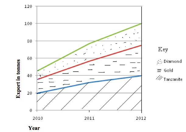
Advantages of compound line graph
- Total values are shown clearly and easily.
- It gives good visual impression.
- Combining all graphs in one saves time and space.
Disadvantages of compound line graph
- Graph construction is difficult and time-consuming.
- It involves a lot of calculations which are difficult and time-consuming.
- It is difficult to read and interpret the value for any one commodity for any particular year.
Divergent line graph
A divergent line graph is a line graph which shows how variables deviate from the mean. The mean is represented by zero axis drawn horizontally across the graph paper.
| Year | Yield (tonnes) |
| 2012 | 1000 |
| 2013 | 1500 |
| 2014 | 500 |
| 2015 | 3000 |
Construction
- Sum up the values of all items or commodities. 1000 + 1500 + 500 + 3000 = 6000
- Calculate the arithmetic mean (average) of the values. 6000/4 = 1500 Thus the arithmetic mean () = 1500
- Calculate the deviation from the mean of each value as shown in the table below.
Deviation from the mean value
| Year | X | X – |
| 2012 | 1000 | -500 |
| 2013 | 1500 | 0 |
| 2014 | 500 | -1000 |
| 2015 | 3000 | +1500 |
- Plot the graph using the values of deviation from the mean; and remember to include the title and scale of the graph.
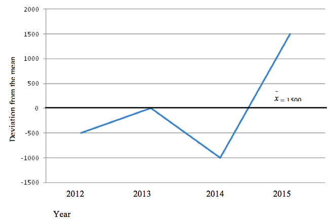
Advantages of divergent line graph
- It clearly shows how items fluctuate from the mean.
- It compares the values of the items and hence facilitates a sound conclusion.
- It shows both the positive (profit) and negative (loss) phenomena.
- It is easy to construct, read and interpret.
Disadvantages of divergent line graph
- It involves many calculations and hence time-consuming.
- It might be difficult to interpret if one lacks statistical skills.
- It is applicable for only one item per graph.
Bar graphs
A bar graph is also called bar chart or columnar graph. This method is used to present data which are not continuous. This means that in a bar graph there is no relationship between or among data.
Bar graphs emphasize individual amounts and their relative variations. When drawing such graphs, bar width in a graph is kept constant while bar lengths change in size as per the amount of the independent variable in question.
Though the bars can also be drawn horizontally, they are usually drawn vertically. The bars should be separated from one another by a space.
Types of bar graphs:
- Simple bar graphs
- Group or comparative bar graphs
- Compound bar graphs
- Divergent bar graphs
Simple bar graph
A simple bar graph is drawn to show a single item per bar. It mainly represents simple data.Consider the data in the table below which shows the value of sisal exported by Tanzania between 1900 and 1993:
| Year | Sisal export (Tsh ‘000) |
| 1990 | 106126 |
| 1991 | 107430 |
| 1992 | 142601 |
| 1993 | 161180 |
| 1994 | 202425 |
Construction:-
- Choose the appropriate scale. However, note that the table below is not drawn to scale – it was drawn using the computer. All hand-drawn graphs must indicate the scale used. For, example, in our graph below, we might have chosen 1 cm to represent 10,000 tones, in which case we could obtain the values 5, 10, 15, 20 and 25 that we could have used to plot the graph.
- Draw the axes and insert the bars. Note that all the bars must have the same width and spacing.
- Shade the bars uniformly by using shade, lines, crosses, dots, etc.
- Insert vertical and horizontal scales and the title.
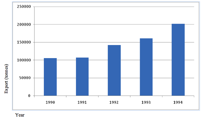
Tanzania sisal export
Scale: 1 cm to 50,000 tonnes
Advantages of a simple bar graph
- It is simple to construct, read and interpret.
- It has a good visual impression.
- It can be used to compare how the amount of an item varies from time to time.
Disadvantages of a simple bar graph
- It is limited to only one item or commodity and hence not suitable for massive data.
- Not suitable for continuous data such as temperature.
Group (comparative) bar graph
A comparative bar graph consists of several bars drawn side by side on the same chart for the purpose of comparison. The technique involves grouping of bars in a chart. The graph can be used to show how production of certain commodities varies each year.
Construction:
The procedure for construction of the comparative bar graph is similar to that of drawing the simple bar graph except that the simple bar graph contains a single bar while the comparative bar graph comprises of multiple bars.
Consider the data in the table below, showing agricultural production in metric tonnes.
| Year/Commodity | 1986 | 1987 | 1988 |
| Sorghum | 1200 | 5000 | 8000 |
| Tea | 9000 | 7000 | 6000 |
| Tobacco | 3000 | 5000 | 4000 |
The graph for the data is as shown below.
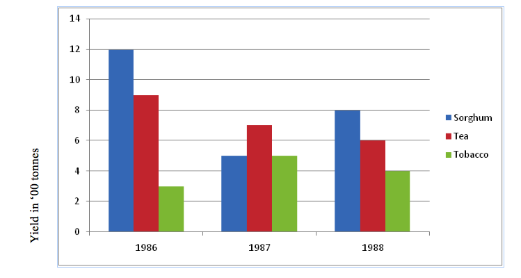
Group (comparative) bar graph showing crop yields in ‘000 kg (1986-1988)
Advantages of a group bar graph
- The total values are expressed well for illustration of points.
- It is easy to construct, read and interpret.
- The importance of each component is shown clearly.
Disadvantages of a group bar graph
- It is difficult to compare the totals of each item/component.
- Trends such as fall and rise cannot be shown easily.
Compound (divided) bar graph
This is a method of data presentation that involves construction of bars which are divided into segments to show both the individual and cumulative values of items. The length of each segment represents the contribution of an individual item in the total length while that of the whole bar represents the total (cumulative) value of the different items in each group.
Construction
- Get the data needed for presentation. For example, consider the table below, which shows the number of tourists who visited the named Tanzania National Parks from 1998 to 2002.
| Year /park | 1998 | 1999 | 2000 | 2002 | 2003 |
| Manyara | 120,000 | 160,000 | 172,000 | 170,000 | 203,000 |
| Serengeti | 175,000 | 160,000 | 148,000 | 185,010 | 201,000 |
| Tarangire | 29,000 | 30,000 | 54,100 | 79,000 | 102,000 |
| Mikumi | 100,000 | 110,000 | 111,000 | 150,000 | 183,400 |
- Simplify the data (to make the presentation work easy) by dividing each value by 10,000. Then add the values to get the total for each year. The simplified data are as shown in the table below.
- Determine the scale of the bar length based on the highest total value. In this case, the highest total value is 68 (20 + 20 + 10 + 18). Recall the construction of the compound line graph! If we choose 1 cm to represent 1 tourist (10,000 tourists in reality), then the length of the tallest bar will be 68 cm. Note that the maximum height of a graph for each year equals the cumulative total values for each year (i.e. 43, 46, 48, 59, 68).
- Decide on the bar spacing, for example, 1 cm apart.
- Draw the axes and label them.
- Start by drawing bars that represent the highest values.
- The first sets of bars to be drawn are those that represent the highest values. On top of these, the second highest segments are drawn. The last segments to be drawn are those with the lowest values in general.
- To make it easy to follow the rise and fall of individual values, a soft line could be drawn across bars to separate individual segments.
- Colour or shade the segments to improve the appearance and simplify interpretation.
- Inset the scales, key and title.
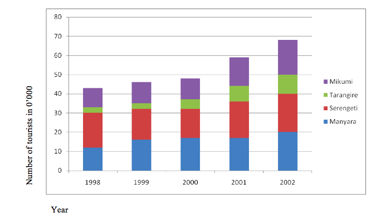
Compound (divided) bar graphs showing tourist visits in 0’000 (1998-2002)
Advantages of compound (divided) bar graph
- It is easy to read and interpret as the totals are clearly shown.
- It gives a clear visual impression of the total values.
- It clearly shows the rise and fall in the grand total values.
Disadvantages of compound (divided) bar graph
- The values of individual segments above the first set are difficult to establish because they don’t start at zero. To get the correct values of the top segments, you have to add the figures, which is difficult for someone not well equipped with statistical skills.
- The graph is very difficult to construct and interpret.
- It is not easy to represent a large number of components as this would involve very long bars with many segments.
Divergent bar graph
A divergent bar graph is a graph which shows the fluctuation of individual items from the mean.
Construction:
- Calculate the arithmetic mean (average) of the items.
- Subtract the mean from each item.
- Draw the graph using the resulting values.
- Insert the scale and title of the graph.
The data below show the enrolment of Form One students at Mara Secondary School from 1980–1985. Study the table and present the data by a divergent bar graph.
| Year | Number of students |
| 1980 | 100 |
| 1981 | 150 |
| 1982 | 175 |
| 1983 | 200 |
| 1984 | 225 |
| 1985 | 300 |
Procedure:
- Find the arithmetic mean:
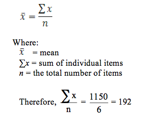
- Subtract the mean from each item:
| Year | Number of students | X – |
| 1980 | 100 | -92 |
| 1981 | 150 | -42 |
| 1982 | 175 | -17 |
| 1983 | 200 | 8 |
| 1984 | 225 | 33 |
| 1985 | 300 | 108 |
- Choose a suitable scale and construct the graph using the obtained values (X – ).
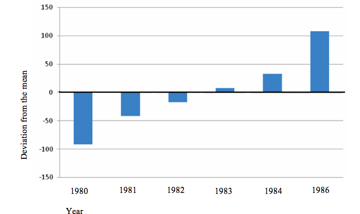
A divergent bar graph showing student enrolment (1980-1985)
Advantages of divergent bar graph
- Fluctuation in values, which helps to detect the problem in general terms, is shown.
- It is important for comparison of positives and negatives.
- Profit (success) or loss (failure) can easily be deduced.
- They are simple to construct, read and interpret.
Disadvantages of divergent bar graph
- Graph construction is time-consuming since it involves many steps.
- The calculations involved may be difficult to someone who is poor at mathematics.
- It is limited to analysis of only one variable.
Divided circles (pie charts)
A divided circle is also known as pie chart, circle chart or pie graph. The chart involves dividing the circle into “pie slices” to represent and show relative sizes of data. The size of each slice or segment is always proportional to the value it represents. Divided circles can appear in two forms:
- Simple divided circles.
- Proportional divided circles.
A simple divided circle involves a single set of data whereas the proportional divided circle involves more than one set of data such that the circles will be proportional to the total quantity that each circle represents.
Simple divided circle
Construction:
- Obtain the data to work on. Study this hypothetical record showing enrolment of Form One students in selected Secondary Schools in Tarime District:
A table showing student enrolment in selected schools in Tarime District
| Name of school | Number of students |
| Nyansincha | 85 |
| Bungurere | 80 |
| Nyanungu | 78 |
| Magoto | 78 |
| Tarime | 65 |
| Nyamongo | 70 |
| Total | 456 |
- Calculate the total number of students as shown in the table.
- Calculate the angle in a circle that would represent the number of students enrolled in each school. For example, 85 out of 456 students enrolled in Nyansincha Secondary School will be represented in the circle by a segment with an angle of 85/456 ×630 = 67 degrees.This will give the following results:
| Name of school | Number of students | Degrees |
| Nyansincha | 85 | 67° |
| Bungurere | 80 | 63° |
| Nyanungu | 78 | 62° |
| Magoto | 78 | 62° |
| Tarime | 65 | 51° |
| Nyamongo | 70 | 55° |
| Total | 456 | 360° |
- Draw a circle of a reasonable size.
- Using a protractor, draw a radius from the 6 o’clock mark to the centre of the circle.
- Starting with the largest segment representing a specific component, measure and draw its angle from the centre of the circle.
- Do the same for other components in ascending order.
- Divide a circle into segments according to the sizes of the angles.
- Shade the segments and write the title and key of the drawn graph.
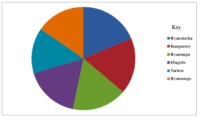
Student enrolment in selected Secondary Schools in Tarime District
Advantages of divided circles
- It is easy to compare components as they are represented by angles.
- Analysis and interpretation of data is easy.
- It is easy to assess the proportion of individual components against the total.
- Construction of this graphical representation is relatively simple.
- It is easy to determine the value of each component since it is indicated on each segment.
- Visual impression of the individual components is clear and facilitates the understanding of the information in the data.
Disadvantages of divided circles
- It is time-consuming because it involves a lot of calculations.
- The represented actual values remain hidden as the values shown on the faces of the segments may be in percentages.
- Where the range of data is large and involves small and big values, accurate construction of the chart is difficult.
- When the values of data set vary slightly, it is difficult to visualize the proportional differences between values (as it is the case in the pie chart above).
The Importance of Statistics to the User
Explain the importance of statistics to the user
Statistics is important in geography because of the following reasons:
- It enables the geographers to handle large sets of data and summarize them in a way that can be easily understood.
- It can also enable the geographers to make comparisons between geographical phenomena, e.g. to compare the amount of rainfall and agriculture production or population distribution in different regions, etc.
- Statistics translates data into mathematical ways which make the application of quantitative techniques possible.
- It enables the geographers to store the information in forms of numbers, graphs, tables, charts, etc.
- Statistics give precise rather than generalized information. This offers a lot of satisfaction to the user.
- Statistics is very useful for planning at local and national levels. For example, statistics on census can be used to plan for social services.
How Massive Data can be Summarised
Describe how massive data can be summarised
The massive data collected from the field have to be summarized so as to make it easy to read, interpret and apply. The massive data can be summarized by the following ways:
Frequency distribution
A frequency distribution shows a summarized grouping of data divided into mutually exclusive classes and the number of occurrences in a class. It is a way of showing unorganized data e.g. to show results of an election, income of people for a certain region, sales of a product within a certain period, student loan amounts, etc. Some of the graphs that can be used with frequency distributions are histograms, line charts, bar charts and pie charts. Frequency distributions are used for both qualitative and quantitative data.
Frequency distribution helps to determine how many times a certain score occurs in a sample. In statistics, a frequency distribution is a table that displays the frequency of various outcomes in a sample. Each entry in the table contains the frequency or count of the occurrences of values within a particular group or interval. In this way, the table summarizes the distribution of values in the sample.
Consider the following table which shows family size of 20 families which were interviewed in a certain village:3, 2, 2, 4, 3, 7, 8, 1, 3, 6, 2, 2, 4, 5, 6, 4, 3, 4, 5, and 2.
The data can be summarized in a frequency table thus:
- Arrange the scores in a descending order from 8 to 1. It is advised to arrange the scores in ascending order.
- Distribute each score in the sample to determine the number of times each score occurs (frequency) in the data sample.
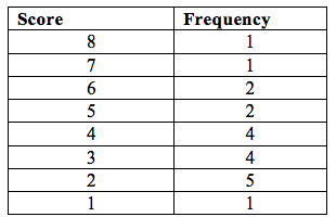
The frequency indicates how many times a score or event appears or occurs in a sample.However, in each case, it is certainly difficult to deal with individual scores separately. In such cases, a grouped frequency is used.
The steps for making a grouped frequency are as follows:
- Decide about the number of classes. Too many classes or too few classes might not reveal the basic shape of the data set; also it will be difficult to interpret such a frequency distribution. The maximum number of classes may be determined by formula: Number of classes = C = 1 + 3.3log(n) or C = √n(approximately) where n is the total number of observations in the data.
- Calculate the range of the data (Range = Max – Min) by finding minimum and maximum data value. Range will be used to determine the class interval or class width.
- Decide about the class interval denote by h and obtained by h = Range/Number of classes
- Decide the individual class limits and select a suitable starting point of the first class which is arbitrary, it may be less than or equal to the minimum value. Usually it is started before the minimum value in such a way that the midpoint (the average of lower and upper class limits of the first class) is properly placed.
- Take an observation and mark a vertical bar (|l) for a class it belongs. A running tally is kept till the last observation. However, it is not always necessary to show tallies in the Frequency Distribution Table because the frequency column serves the same purpose.
- Find the frequencies, relative frequency, cumulative frequency etc. as required.
Frequency distribution table
| Class interval | Frequency | Cumulative frequency |
| 0 – 9 | 4 | 4 |
| 10 – 19 | 9 | 13 |
| 20 – 29 | 8 | 21 |
| 30 – 39 | 3 | 24 |
| 40 – 49 | 4 | 28 |
| 50 – 59 | 7 | 35 |
| 60 – 69 | 5 | 40 |
| 70 – 79 | 4 | 44 |
| 80 – 89 | 2 | 46 |
Characteristics of the class interval
- A score appears only once. That means no score should belong to more than one class.
- The size of the class interval should be the same. No score should fall in more than one class. Arrange the class intervals in order of ranks as shown in the frequency distribution table above.
- The class intervals should always be continuous.
- The range of class interval should be between 3 and 20. Thus, the intervals should not be below 3 and not above 20.
From the summarized data in the table above, one can identify two concepts:
- Apparent upper limit
- Apparent lower limit
These limits (or boundaries) are seen in each class interval. The apparent lower limit opens the class interval while the apparent upper limit closes the class interval.The table above shows 80, 70, 50, 40, 30, 20 and 10 as apparent lower limits and 89, 79, 69, 59, 49, 39, 29, 19 and 9 as the apparent upper limits.
Apart from the two concepts above, the table has real limits which are not visible. These are 0.5 below or above the apparent limits.
From the above summarized data, other measures of statistics can be deduced. Such measures include the measures of central tendency, measures of dispersion (variability), measures of relationship (correlation) and measures of relative position.
Simple Statistical Measures and Interpretation
Methods of Presenting Simple and Mixed Data
Describe methods of presenting simple and mixed data
Measures of central tendency (averages)
A measure of central tendency is a single value that attempts to describe a set of data by identifying the central position within that set of data. As such, measures of central tendency are sometimes called measures of central location. They are also classed as summary statistics. The mean (often called the average) is most likely the measure of central tendency that you are most familiar with, but there are others, such as the median and the mode.
The mean, median and mode are all valid measures of central tendency, but under different conditions, some measures of central tendency become more appropriate to use than others. In the following sections, we will look at the mean, mode and median, and learn how to calculate them.
The Mean, Mode and Median
Calculate the mean, mode and median
Arithmetic mean
The mean (or average) is the most popular and well known measure of central tendency. It can be used with both discrete and continuous data, although its use is most often with continuous data. The mean is equal to the sum of all the values in the data set divided by the number of values in the data set. So, if we have n values in a data set and they have values x1, x2, ..., xn, the sample mean, usually denoted by (pronounced x bar), is:

This formula is usually written in a slightly different manner using the Greek capital letter, ∑, pronounced "sigma", which means "sum of...":
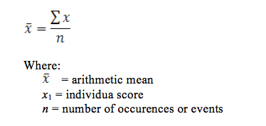
Example 1
In English exam, students obtained the following percentage scores: 45, 42, 35, 86, 40, 56, 87, 40, 35, 74, 68 and 50
The arithmetic mean of the score is:

The average score was 54.8%
Advantages of the mean
- It is rigidly defined by a mathematical formula
- It is easy to understand and calculate
- It is based on all observations
- It is determined in all cases
- It is suitable for further mathematical treatment or manipulation
- Compared to other averages, arithmetic mean is affected least by fluctuation of sampling
Disadvantages
- It is greatly affected by extreme values of the data
- It cannot be obtained if a single observation (item) is missing
- It is not appropriate in some distributions
Median
The median is the middle score for a set of data that has been arranged in order of magnitude. Suppose we want to find the median from the data below:
65, 55, 89, 56, 35, 14, 56, 55, 87, 45, 92
We first need to rearrange that data in order of magnitude (smallest first):
14, 35, 45, 55, 55, 56, 56, 65, 87, 89, 92
Our median mark is the middle mark - in this case, 56 (highlighted in bold). It is the middle mark because there are 5 scores before it and 5 scores after it. This works fine when you have an odd number of scores, but what happens when you have an even number of scores? What if you had only 10 scores? Well, you simply have to take the middle two scores and average the result. So, if we look at the example below:
65, 55, 89, 56, 35, 14, 56, 55, 87, 45
We again rearrange the data in order of magnitude (smallest first):
14, 35, 45, 55, 55, 56, 56, 65, 87, 89
Only now we have to take the 5th and 6th score in our data set and average them to get a median of 55.5.
Advantages of the median
- It is easy to calculate and understand
- It can also be calculated in qualitative data
- It is appropriate for skewed distribution
- It is not affected by all extreme observations. Hence, it is a better average than the arithmetic mean when extreme observations are present.
- The values of a median can be obtained graphically.
Disadvantages
- It is not suitable for further mathematical treatment.
- It is not rigidly defined.
- It is based on all values or observations.
- Compared to mean, median is more affected by fluctuation of sampling.
- In case of ungrouped data, rearrangement of values in order of magnitude becomes necessary.
Mode
The mode is the most frequent score in a data set. It represents the highest bar in a bar chart or histogram. You can, therefore, sometimes consider the mode as being the most popular option. An example of a mode is presented below:
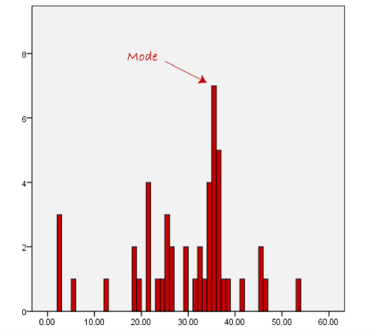
Normally, the mode is used for categorical data where we wish to know the most common category, as illustrated below:
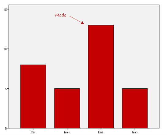
We can see above that the most common form of transport, in this particular data set, is the bus. However, one of the problems with the mode is that it is not unique, so it leaves us with problems when we have two or more values that share the highest frequency, such as below:
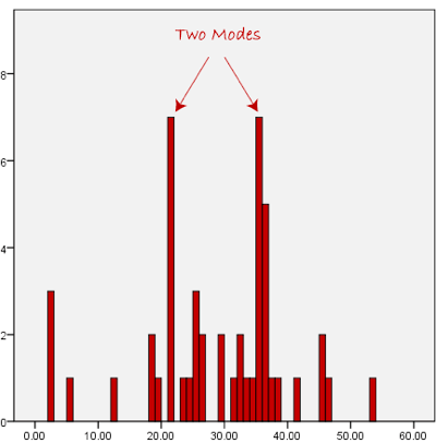
Another problem with the mode is that it will not provide us with a very good measure of central tendency when the most common mark is far away from the rest of the data in the data set, as depicted in the diagram below:
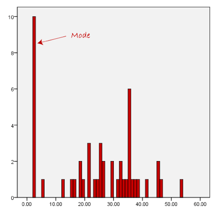
In the above diagram the mode has a value of 10. We can clearly see, however, that the mode is not representative of the data, which is mostly concentrated around the 2 to 3 value range. To use the mode to describe the central tendency of this data set would be misleading.
Advantages of the mode
- It is simple to compute.
- It is easy to understand and calculate. In some cases it can be located merely by inspection. The value of the mode can be obtained graphically from the histogram.
- It gives a rough idea of the differences of the data set.
- It is the only average that can be used when the data is not numerical.
Disadvantages
- It is not rigidly defined; hence it is unstable for large samples.
- It is independent of sample size except under special circumstances.
- It is not based on all the values of the data.
- Mode is not suitable for further mathematical treatment.
- As compared to mean, mode is affected to a great extent by the fluctuation of sampling.
- There may be more than one mode (as is the case in the previous graph).
- There may be no mode at all if none of the data are the same. 8. It may not accurately represent the data.
The Significance of Mean, Mode and Median
Explain the significance of mean, mode and median
Measures of central tendency are very useful in statistics. Their importance is because of the following reasons:
- To find representative value: Measures of central tendency or averages give us one value for the distribution and this value represents the entire distribution. In this way averages convert a group of figures into one value.
- To condense data: Collected and classified figures are vast. To condense these figures we use average. Average converts the whole set of figures into just one figure and thus helps in condensation.
- To make comparisons:To make comparisons of two or more than two distributions, we have to find the representative values of these distributions. These representative values are found with the help of measures of the central tendency.
- Helpful in further statistical analysis: Many techniques of statistical analysis like Measures of Dispersion, Measures of Skewness, Measures of Correlation, and Index Numbers are based on measures of central tendency. That is why measures of central tendency are also called measures of the first order.
Interpretation of Data using Simple Statistical Measure
Interpret data using simple statistical measures
In the section about averages (mean, mode and median), we learned how to calculate the mean for a given set of data. The data we looked at were ungrouped and the total number of elements in the data set was not that large. The method is not always a realistic approach especially if you are dealing with grouped data.
Assumed mean (A), like the name suggests, is a guess or an assumption of the mean. It doesn't need to be correct or even close to the actual mean and choice of the assumed mean is at your discretion except for where the question explicitly asks you to use a certain assumed mean value.
Assumed mean is used to calculate the actual mean as well as the variance and standard deviation.
Measures of central tendency can be calculated from grouped data, for example:
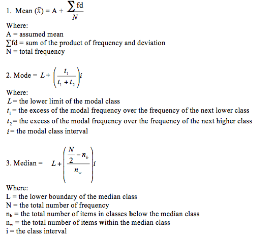
Calculation of measures of central tendency for grouped data
Study the frequency distribution table below:

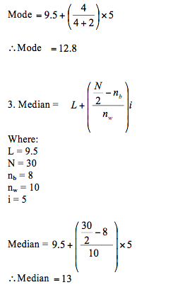
Calculation from the table:
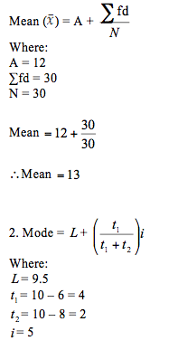
Assumed mean (A) = 12
Note: we find the class interval by using the class limits as follows: i = upper class limit – lower class limit + 1


No comments:
Post a Comment